
#WorkoutWednesday 2018 Week 52
Whenever I’m presented with a visualization design that I’ve never seen before I react in one of two ways: total confidence or total bewilderment. This week, I was firmly in the latter camp.

I reached out to Ann on Twitter, is it okay to admit I need some help? Since I started participating in WoW I’ve been able to get there by playing with the dashboard on Tableau Public and using the instructions provided on the WoW blog post. This time, however, I wasn’t even sure where to begin. To create this many marks on a single sheet with dates was a challenge that I was unsure how to approach.
When I see a timeline I think continuous dates. However, there were far too many marks that would need to appear on the visual. Dates can be continuous or discrete, but they cannot be measures and therefore I wasn’t able to use the Measure Values pill.

I needed measures.
I had to download the workbook to see, I had no idea what my next steps were. After opening and looking I immediately could see that the dates were converted to integers. After all those years of playing with dates in Excel, this should have been immediately apparent, yet the idea to turn the dates into integers didn’t occur to me.
Sometimes you need a helping hand or a breadcrumb trail. That’s okay. It’s the visual analytics journey that counts — learning the many ways Tableau functions will occasionally need a walkthrough and explanation. Workout Wednesday is about expanding skills to better visualize data, turning it into insightful and impactful information you can use personally and professionally.
This is why I WoW, now let’s keep going on the journey.
The approach
Starting a new dashboard with a pad of paper is an analogue left-over from days past. A fountain pen and some scratch paper are one of my most powerful analytical tools.
Start by taking notes of things which stand out in the design. Call out objectives, concerns, and parts where you are not familiar or the solution isn’t immediately apparent. I see no point in writing down obvious facts — note what you need to do and ideas of how to approach to accomplish the task.
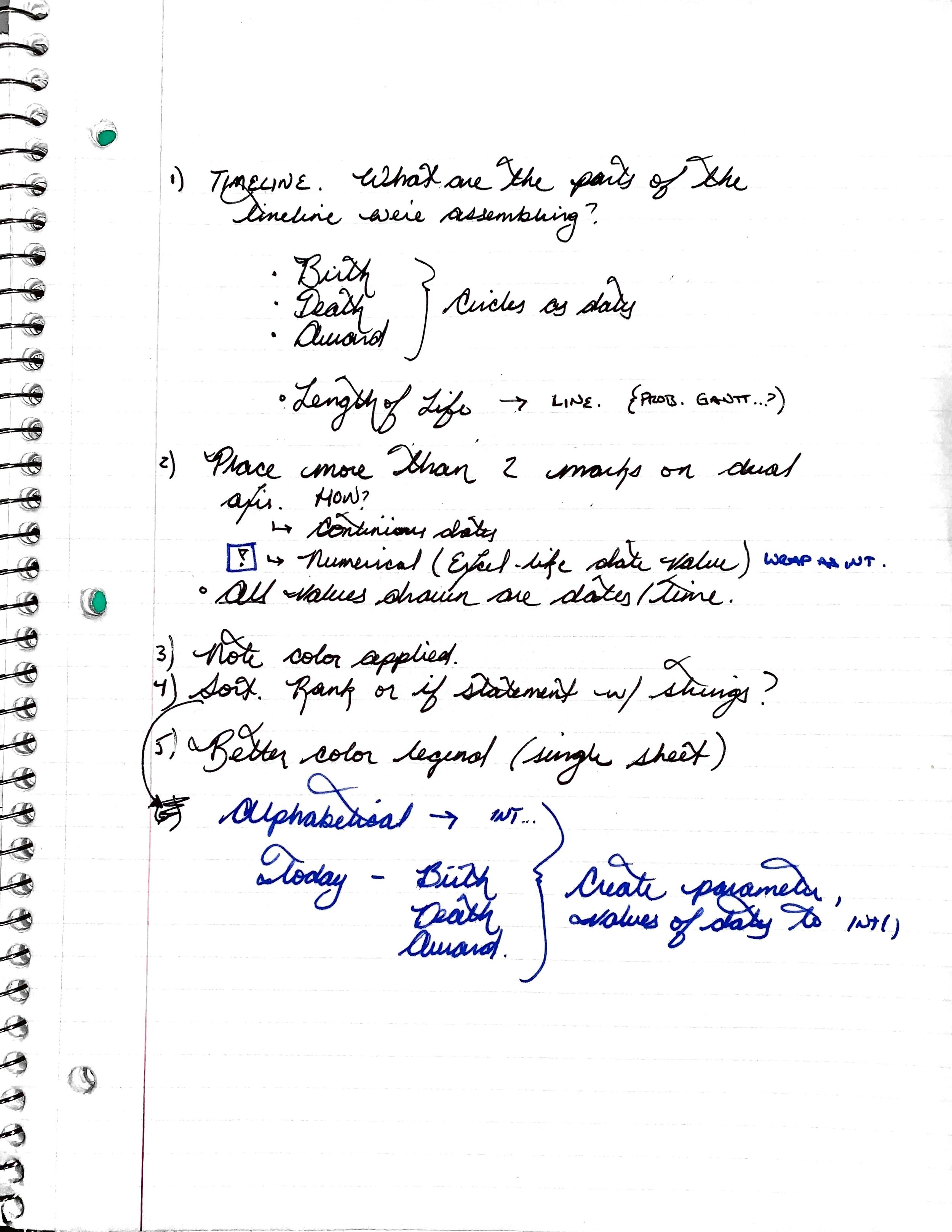
Let’s go over the three main components to completing this challenge: Timeline, Legend, and Sorting.
Creating the timeline
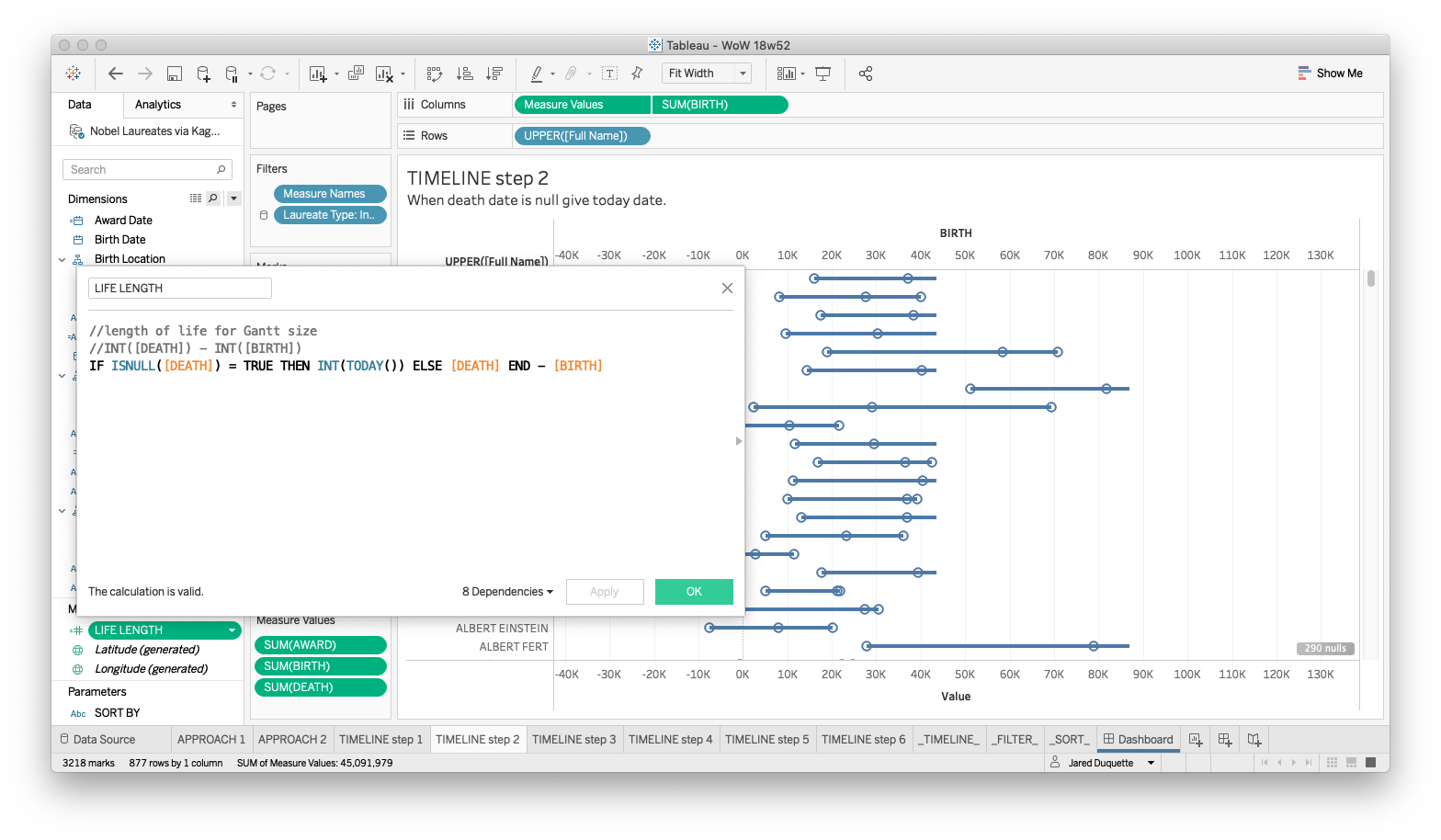
I took care to better note the steps taken in completing this weeks challenge and have separate worksheets in the .twbx file for each of the following six steps on the timeline creation. Download the .twbx to follow along!.
Step 1 - The Basics
Create the basic outline of the visual. We know that there are circles for the dates and a line representing the length of life. We’ll create a calculated field for length of life and use Measure Values to populate the various dates on a dual axis chart.

Step 2 - Date Completion
When the date of death is null, replace with the current date.
Step 3 - normalize values
Now that everyone has a life length, we see where today values do not line up. This doesn’t make sense for this timeline chart. We’ll want to have today appear at the same axis point on all persons who have received an award. There are two ways we can do this:
Create a Primary Key combining name, award date, and award type; or,
Turn off aggregation.
We’ll go with the latter here as we will not need the unique primary key in any other functions in the challenge.

Step 4 - add reference lines
Add the two reference lines. One with the current date, the other for the start of the nobel awards. I went with typing the values into the pill shelf on the Birth Date mark card as I have no plan of reusing this value.

Step 5 - Formatting
Format the dashboard. Select both Measure Names and Category and drag onto the shapes mark card. With the Category pill before the Measure Name pill, the text of the combinations will format in a more manageable manner.
Step 6 - Add to the Dashboard and review
Cleanup and ready to insert into the dashboard.
Creating the color legend.
Color legends that come direct from the Tableau workbook sheets are hard to format in a way that gives full control of text position and size.
What I love about using separate sheets for the filter is the ease of manipulating the layout and moving from text only or text plus a colored shape.

Creating the sort
Create the sort using a text parameter for all of the options defined by looking at the dashboard on Tableau Public. What sort of sort options are there?


Thanks to the amazing Tableau community for #WorkoutWednesday2018. This is a powerful tool to weekly increase your visual analytics toolkit. Thanks to Ann and all of the WoW contributors for a great year, look forward to a jam-packed 2019 and Tableau Conference 2019!

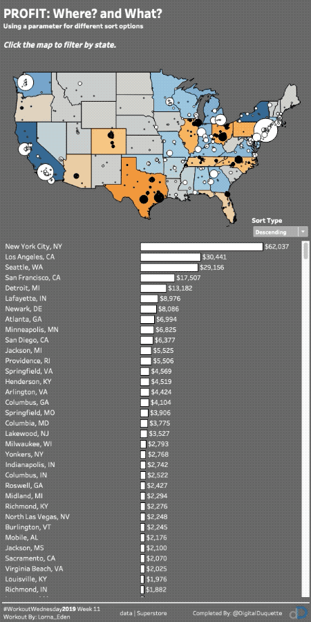
Nobel Laureats, 1901 to Today
View the completed WoW submission on Tableau Public by clicking the button below:
Happy dashboarding!
Created a quick video walk through of the challenge, more to come in 2019!