Barchart Bakeoff: To Radial or Not to Radial
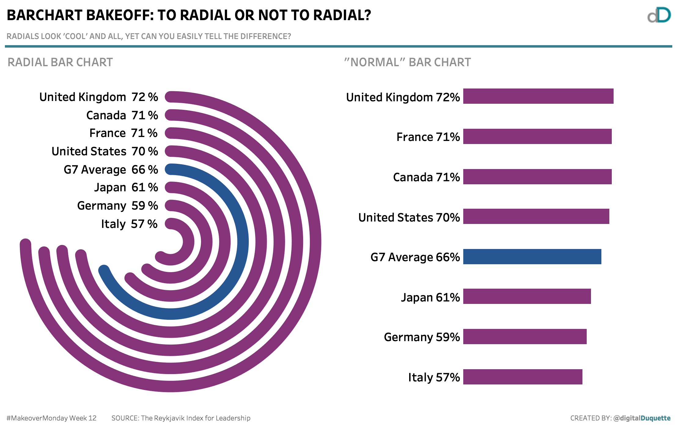
#MakeoverMonday week 12 2019 takes a look at how we really feel about women leaders, presenting the findings in a radial bar chart: far too close to a pie chart for comfort. My opinion on radial bar charts is well known to my team members - they’re hard to make and harder to read. Even so, these chart types are popular, because at first glance, they look really cool.
Cool doesn’t mean functional.
Using this #MakeoverMonday data set, I wanted to show the difference between radial and ’normal’ bar charts. Radials are hard to make and even harder to read - and this viz shows the difference, which would you pick?
Download the submission from Tableau Public here. Tableau radial charts are not easy to make, but if you’re up for it, you can see the Tableau Magic blog post and give it a shot. Andy Kriebel made a blog post quickly explaining how to create a rounded bar chart which I used to compare to the radial.
Are you curious about #MakeoverMonday? Head over and checkout the page to read up and get your #DataViz on!


